Elements of Poetic pages
This topic lists some of the common user interface elements used in the system.
Every page, button, and link can be secured. Each user is assigned a security role that determines their security privileges. Your security privileges, company type, and the application configuration determine the pages and fields that you have access to.
Menus
Poetic can include the following types of menus:
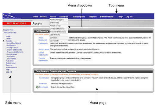
Top menu
Depending on the application configuration, at the top of each page is the Poetic main menu. This menu includes:
- A link to the Home page
- Links to each menu.
Moving the mouse over the menu name displays a dropdown listing the available menu options.
A link to the help system
A link to log out of the application
Side menu
Depending on the application configuration, on the left of each page is a collapsible menu listing all of the options available in the application. The side menu includes the Home, help, and log out links as well as links to each menu.
Menu page
When you click a menu heading in the top or side menu, the menu page for that menu displays. The menu page lists the options specific for that menu. The options are in the same order as in the dropdown and the side menu. On the menu page, each option is accompanied by a short description.
Menu pages may be divided into sections.
Page footer
Depending on the application configuration, a footer displays at the bottom of every page. The footer may include:
- Disclaimer and legal information
- Links to the publisher's privacy policy and terms of service
- A link to the help system
- A feedback link with information on how to contact the publisher
- A link to the application version information
Search results
To start most processes, you first select an option from a list of search results. To display the search results, you use the application search function. For more information on how to use the search function, see Conducting searches.
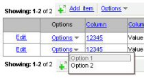
List-level options
Options that affect the entire list, such as adding a new item or exporting the results, are contained in a toolbar that displays above and below the results table.
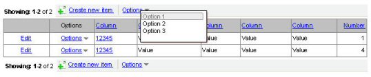
A toolbar item can be a link to a specific option or an Options link to provide access to a list of options.
Sorting search results
If you can use a column to sort a list, the column heading is a hypertext link. To sort by a column, click the column heading. A triangle displays next to the column indicating that the list is being sorted by the column. The direction of the arrow indicates the direction in which it is being sorted.

To sort by the column in the other direction, click the column heading again.

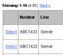
Navigating through the list
If there are too many items in the list to display on a single page, then the search results include a navigation bar to navigate through the list.

Click the Next link to display the next page of results.
Click the Previous link to display the previous page of results.
Selecting a list item
The first column in the results list contains a link for the most commonly used option.
If there are additional options, then the second column contains links to those options. If there are multiple additional options, then the second column contains an Options link to display the list of options.
Page-level toolbars
Optional actions that apply to the entire page, such as returning to the previous page, are contained in a page-level toolbar at the top of the page.
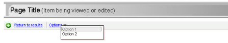
A toolbar item can be a link to a specific option or an Options link to provide access to a list of options.
Tabbed pages
Tabs are used to group information when there are too many fields to place on a single page.
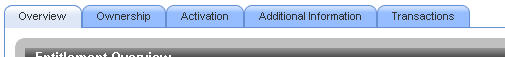
To display the fields on a particular tab, click the tab.
Process pages
Process pages guide users through the steps of a process. The user must complete the current step before continuing to the next page.
Navigation
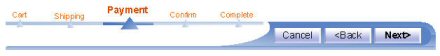
Process pages include a navigation bar. The navigation bar can include both buttons to navigate through the process and a "bread crumb trail" to show the current place in the process:
- Click Next to validate the current page and display the next page.
- Click Back to return to the previous page.
- Click Cancel to cancel the process.
- On the last page of the process, click Finish to complete the process.
Confirmation pages
Many processes include a confirmation page.
Confirmation pages display a summary of the changes that will occur if the process is completed.
Confirmation pages allow you to verify that the results are what you intended before you submit the changes.
If the information is correct, click the Finish button to complete the process.
If you need to make changes, click the Back button to go back to previous pages in the process.
Complete pages
Many processes end with a transaction complete page.
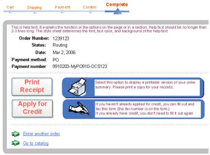
The transaction complete page usually displays after you click the Finish button on a confirmation page.
A transaction complete page lets you know if the transaction succeeded, and provides options for what to do next.
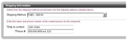
Sections and subsections
Each page can be divided into sections. Sections allow the information or fields on a page to be grouped in a meaningful way. Each section can include help text that provides more information about what is in the section and how to fill in the fields. Sections can also be divided into subsections, which also have help text.
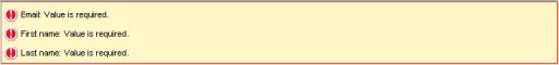
Error and warning messages
Errors, warnings, and notices display at the top of the page or at the top of each section.
For example, if you enter incorrect information, the message indicates what is wrong and how to the correct the problem.
Each type of message includes an icon to tell you whether it is an error, warning, or notice.
- An error indicates a problem that must be corrected before you can continue.
- A warning indicates information that may be incorrect. However, you can continue without making any changes.

- A notice is purely informational.

Types of fields
Text fields
If a field is required, a * displays next to the field label.

If the field requires a value from elsewhere in the system, for example a company name, a find icon displays after the field. Click the find icon to conduct a search for a value to place in the field. See Conducting searches.

Date fields
If a field contains a date or date and time, Poetic displays the format to use next to the field. You can also click the icon to display a calendar tool for selecting the date.

Dropdowns
A dropdown contains a list of available values for a field.
To select a value from a dropdown, click the down arrow button to display the available values, then click a value to select it. The selection displays in the field.
If a value is not required for the dropdown, the list includes a blank option you can select to indicate no selection for the field.
Combo boxes
A combo box is a special type of dropdown.
A combo box includes a field you can type into. As you type, the dropdown list is filtered to select the first matching item.

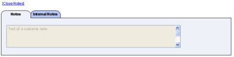
Notes
Several Poetic functions allow you to add notes to provide additional information about the process. For example, when disabling an entitlement, you can type notes indicating why the entitlement is being disabled.
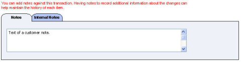
To add a note, type the note text into the appropriate field.
Poetic supports internal and customer notes.
- Internal notes (Internal Notes tab) are usually created by an administrator or a user at the publisher. Viewing and creating internal notes requires specific security privileges.
In cases where multiple users can add notes over time, the Internal Notes tab includes an Add Internal Notes button users must click before they can enter a note. Clicking the button adds a date and time stamp for each note.
- Customer notes (Notes tab) are usually available for all users to view and edit.
Transactions tab
When you view or edit information, the page may include a Transactions tab.
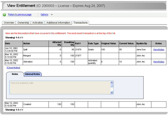
The Transactions tab provides a history of the changes that have occurred to that particular item.
While each Transactions tab includes information specific to the type of item, the basic columns are:
| Date | The date on which the transaction occurred. |
| Action/Transaction type | The type of action that occurred. |
| Detail/Data type | The type of data that was affected. |
| Original Value | The value of the affected data before the change. |
| Current Value | The value of the affected data after the change. |
| Updated By | The user who made the change. |
If there are any notes concerning a particular transaction, then the Notes column contains a View Notes link.

Click View Notes to display the notes information for that transaction.